Learnium Mobile Application
PRODUCT DESIGN · MOTION DESIGN
INTRODUCTION
Learnium addresses a common challenge in education—ineffective learning methods. Traditional passive learning often leads to poor understanding and retention. Our solution leverages generative AI to transform learning into an interactive and engaging experience.
MY ROLE
Research, analysis, product design, design systems, user-testing.
THE TEAM
4 designers, 4 developers
Timeline
September 2023 - November 2023
problem statement
Passive learning methods, like reading or watching videos, often result in poor understanding and retention. While interactive learning offers better outcomes, it's perceived as hard work. How might we make learning interactive and engaging?
breakdown of the problem
Study schedules don't change based on what you need or when your exams are, which can make studying overwhelming or boring.
It's tough to stay interested in learning when you're not actively studying, and this can make it harder to remember what you've learned.
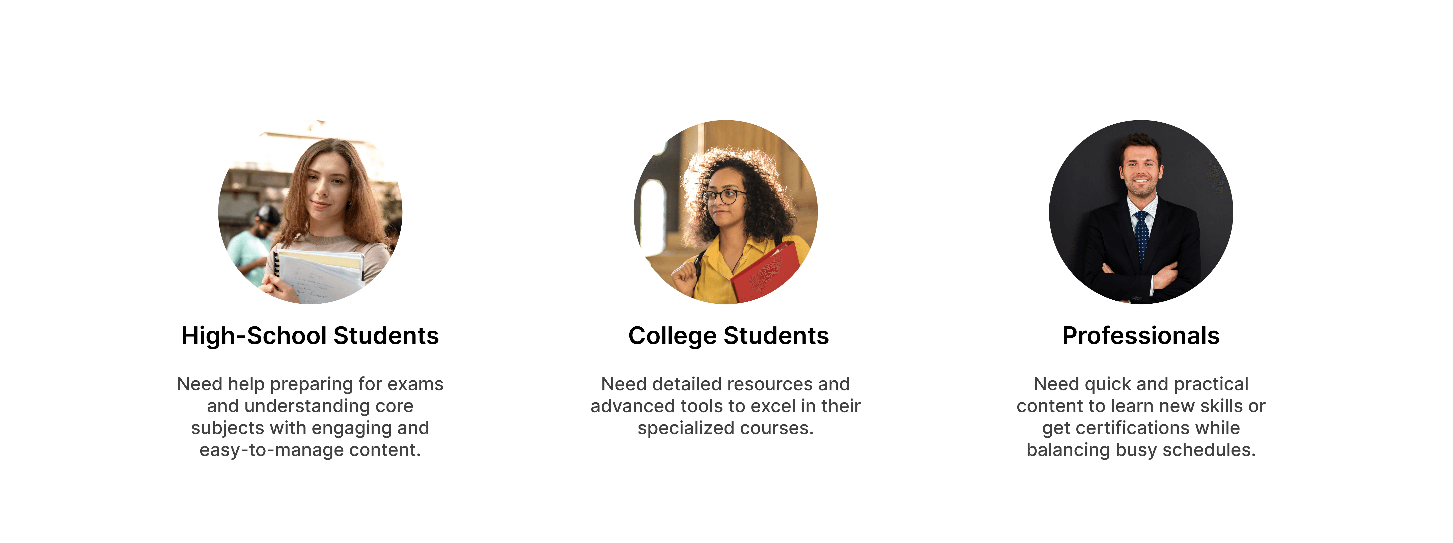
THE USERS OF LEARNIUM
For Learnium, we interviewed 9 different users and also designed a survey and gathered answers from 49 college and university student to understand their needs and challenges with learning.
We learned about three main types of learners: high-school students, college/university students, and professionals seeking career growth.
User research & survey
Designing experiences for learners required us to understand what value the learning process brings into their lives, specifically for high school, university and college students.
What is the ideal length for a quiz session to help you feel adequately prepared?
What types of exams are you primarily preparing for?
How confident do you feel after completing a quiz on a learning app?

PROCESS
To start building the Learnium app, we looked closely at other similar products. We wanted to see what they do well and where they need to improve. This involved checking out what other apps are doing through a competitor analysis.
KEY TAKEAWAYS
User interviews highlighted the need for interactive content and personalized learning experiences, leading to features like summarized content and quizzes
Careful branding and UI design aimed to create an engaging experience, with flat design and micro-interactions enhancing user engagement.
To ensure Learnium remains user-friendly and aligned with user needs, we underwent multiple iterative processes, incorporating user feedback to drive enhancements over time.
Survey insights directly influenced the app's early design, shaping features to align with student preferences.
Design Goals

Intuitive
Create a user-friendly interface that guides users seamlessly through the learning journey, reducing cognitive load and enhancing usability

User-Centered
Adopt a user-centered design approach to continuously gather feedback, iterate on designs, and refine the app based on user needs and preferences

Micro-interactions
Using motion design principles to enhance user engagement and delight by adding subtle animations and transitions throughout the app.
User journey and wireframing
Designing experiences for learners required us to understand what value the learning process brings into their lives, specifically for high school, university and college students.
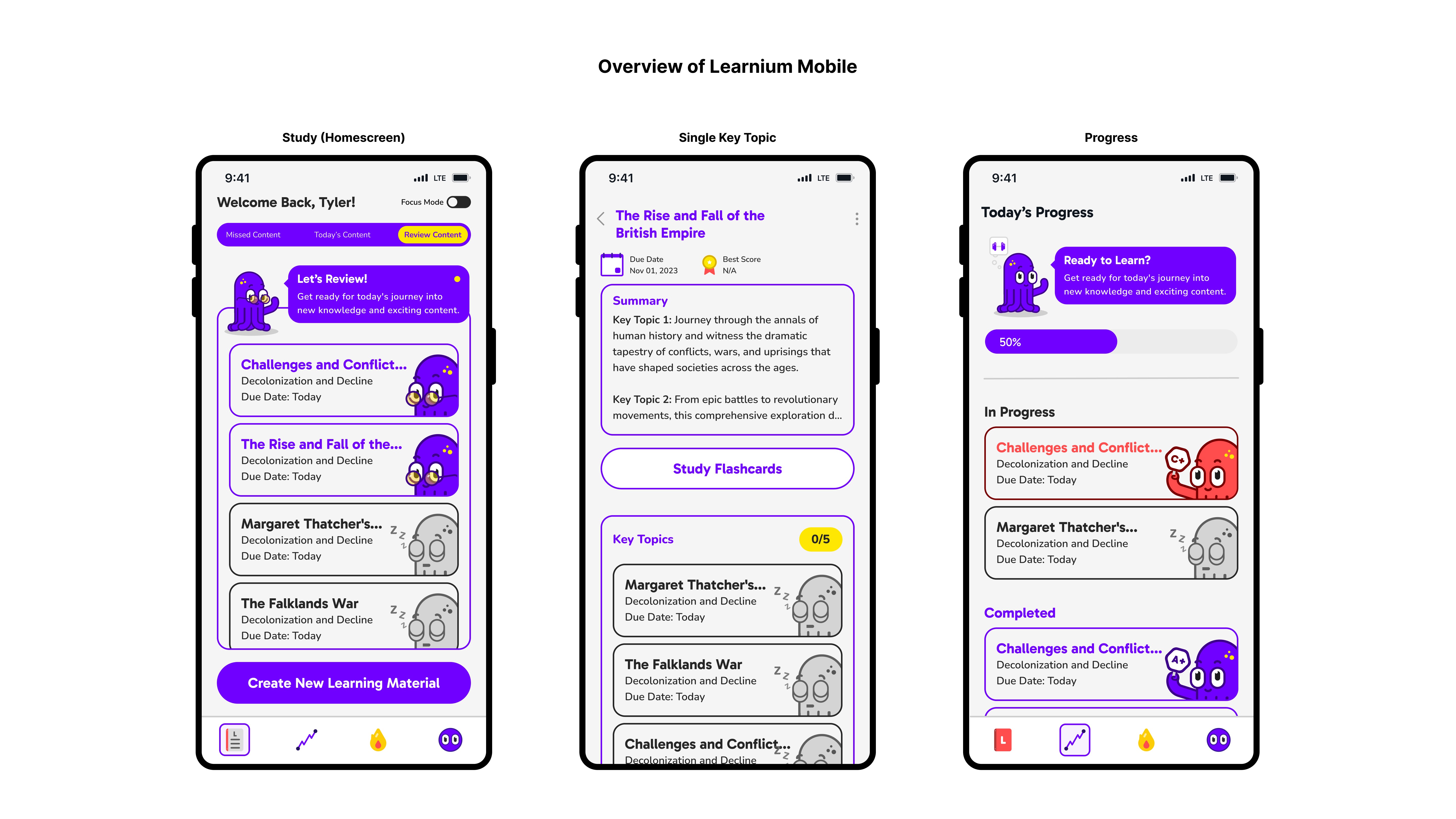
Study (Homepage)
Users find missed, review, and today's learning content on the homepage, with a button to upload new material and set exam dates.
Progress
Users track daily learning progress and specific material progress.
Daily
Users engage with daily questions and interesting facts
Account
Users manage profile settings and can log out

visual design decisions
Through our choice of colors, typography, imagery, and mascot, we aim to create a visually engaging platform that reflects our values of simplicity, creativity, and reliability.

How can we design a color palette and typography that caters to the needs of Learnium's learners, ensuring visual harmony and maximizing user engagement?
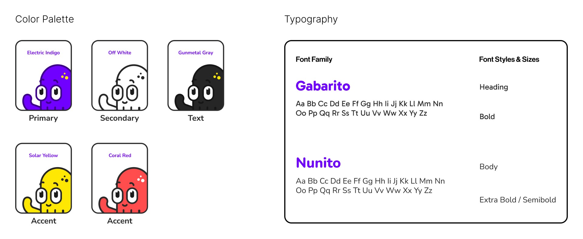
│Color Palette
We chose purple and white as main colors for a clean, creative look. Yellow and coral were added for fun and to compliment the primary palette.
│Typography
We picked Gabarito Bold for headings and Nunito for body text because it's easy to read. These choices help with readability and a consistent look throughout the app.
Reinforcing Brand Identity and Enhancing Clarity in Quiz Results
Incorporating character Dr. Lumi into the quiz results page reinforced the app's brand identity, creating a memorable user experience. Simultaneously, distinguishing between correct, incorrect, and unanswered answers aimed to improve comprehension, usability, and learning outcomes.

solution
Final Outcome: Highlights
Each highlight captures an aspect of the Learnium experience. It calls out which design goal it adheres to, what user scenario or problem it's addressing, and what the solution is.

DESIGN GOAL: INTUITIVE
Tabs instead of carousels
USER SCENARIO
Users found it challenging to navigate through the content using a carousel format, as it required excessive swiping and was not immediately clear.
Solution
Replacing the carousel with a tab system at the top of the screen allows users to easily switch between three different sections. This change aligns with common user behaviors and enhances overall familiarity, making navigation more intuitive and efficient.
DESIGN GOAL: INTUITIVE
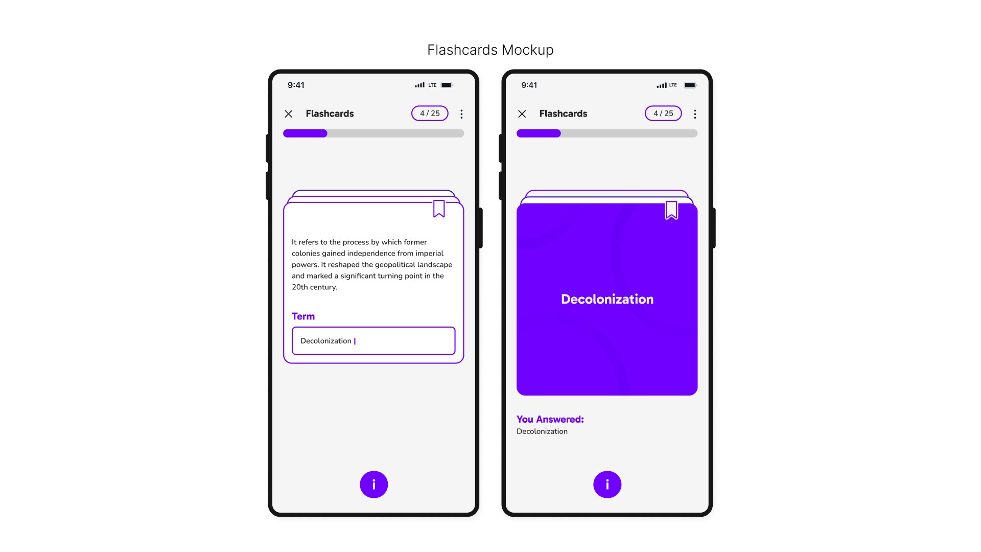
Flashcards Resembling Traditional Cards
USER SCENARIO
The initial flashcard design did not resemble traditional flashcards, this confused the users on how to interact with them.
Solution
We redesigned them to look like real flashcards, with two extra cards showing behind the top one. This makes it easier for users to understand and use the feature.
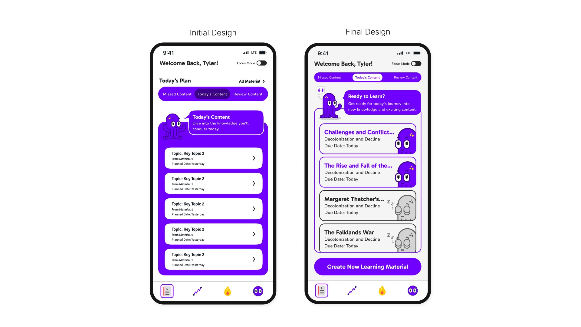
DESIGN GOAL: User-centered
Home Screen Button and Color Change
USER SCENARIO
The first home screen design was overwhelming because of the prominent purple color was too intense.
Solution
We changed the full purple background to a subtle purple stroke and removed confusing buttons like "All Material" and "Study Plan." This made the home screen clearer and more welcoming, improving user comfort and navigation.
DESIGN GOAL: MICRO-INTERACTIONS
"Sleeping" Key Topic Animation
USER SCENARIO
Initially, users found it difficult to distinguish between topics they had started and those they had yet to touch. The grey button used for untouched topics was often mistaken for a disabled button.
Solution
We added an animation of Dr. Lumi sleeping ("zzz") on the grey buttons. This makes it clear which topics haven't been touched yet.
DESIGN GOAL: MICRO-INTERACTIONS
Navigation Bar Animation
USER SCENARIO
The static navigation bar didn't give users enough feedback or make the app feel engaging.
Solution
We added animations to the navigation bar to create emotion and personality, provide feedback and guidance, and encourage user engagement. This motivates users to interact more with the app.
Learnings and relfections
│Importance of usability testing
We planned to do usability testing after making wireframes and mockups to understand user needs better. Due to our tight 12-week schedule, we couldn't do multiple tests. Despite this, we stay committed to focusing on the user and will include user feedback in future updates.
│Balancing time and quality
Our tight timeline made us balance speed and quality. This taught us the importance of having efficient processes that allow for essential testing phases, ensuring the final product meets user needs while staying on schedule.
│Simplicity in design
Complex interfaces can confuse users. Simplifying the user flow and reducing clutter on the home screen made navigation easier and improved the overall user experience.