Steam App Redesign
PRODUCT DESIGN
INTRODUCTION
Steam is a leading digital distribution platform for video games, serving millions of users worldwide. Despite its popularity, the Steam website had become cluttered and difficult to navigate, with a dated design that didn't adequately address the diverse needs of its users. I wanted to redesign the Steam website to create a modern, user-friendly experience that caters to both new and seasoned gamers.
MY ROLE
Research, analysis, product design
THE TEAM
Solo designer
Timeline
1 week
problem statement
The Steam website, initially designed for a broad range of gamers, became cluttered and hard to navigate as the platform grew. It struggled to meet the diverse needs and complex workflows of its users, from new gamers to seasoned veterans.
How might we redesign the Steam website to provide a seamless, engaging, and intuitive experience for all users, while maintaining simplicity and delight across the diverse gaming community?
breakdown of the problem
Navigation Complexity
Users find it challenging to move around the platform due to a cluttered layout and unclear organization of information.
Information Overload
Users feel overwhelmed by the amount of content presented on each page, making it difficult to focus on relevant information.
Disconnected User Journey
Users experience disjointed interactions as they navigate between different sections of the platform, with content lacking cohesion and consistency.
Outdated Design
The platform's design feels old-fashioned and does not align with modern user expectations, resulting in usability issues and a lack of visual appeal.
THE USERS OF Steam
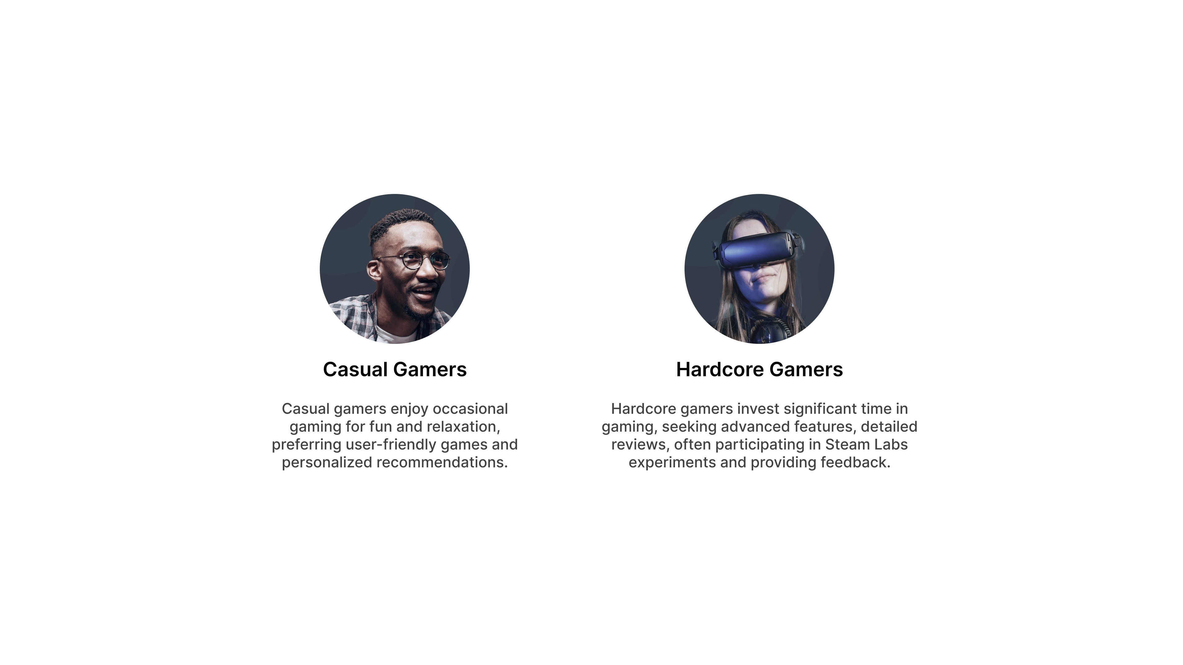
Steam serves a diverse user base, spanning casual gamers to dedicated professionals, providing relaxation and entertainment across various interests and demographics.
Our users include college students who seek engaging, manageable games and appreciate discounts and personalized recommendations. Professionals balance gaming with busy work lives, valuing immersive experiences and social interaction through multiplayer games. Casual gamers enjoy user-friendly games for fun and relaxation, preferring personalized suggestions. Hardcore gamers invest significant time in gaming, seeking advanced features, detailed reviews, and active community engagement, often participating in Steam Labs experiments and providing feedback.
PROCESS
I began the process with a thorough review of the current user experience on Steam.
KEY TAKEAWAYS
Creating user journeys for casual and hardcore gamers revealed significant redundancy in the app, exacerbating navigation challenges.
The existing design had low usability scores based on my benchmarking.
The user flow was overly complex, making navigation difficult.
The UI was outdated and needed a modern refresh.
Design Goals

Modern Aesthetic
Aim to update the visual style with contemporary design elements, ensuring a clean and appealing look that aligns with current design trends.

Simplified Navigation
Focus on decluttering the interface and streamlining navigation, making it easier for users to find what they need quickly and efficiently.

Enhanced Content Accessibility
Prioritize the organization and presentation of content to ensure users can access important information easily and without feeling overwhelmed.
PROCESS
In redesigning the Steam website, I systematically addressed usability issues to enhance user experience, gaining valuable insights that shaped a more intuitive platform.
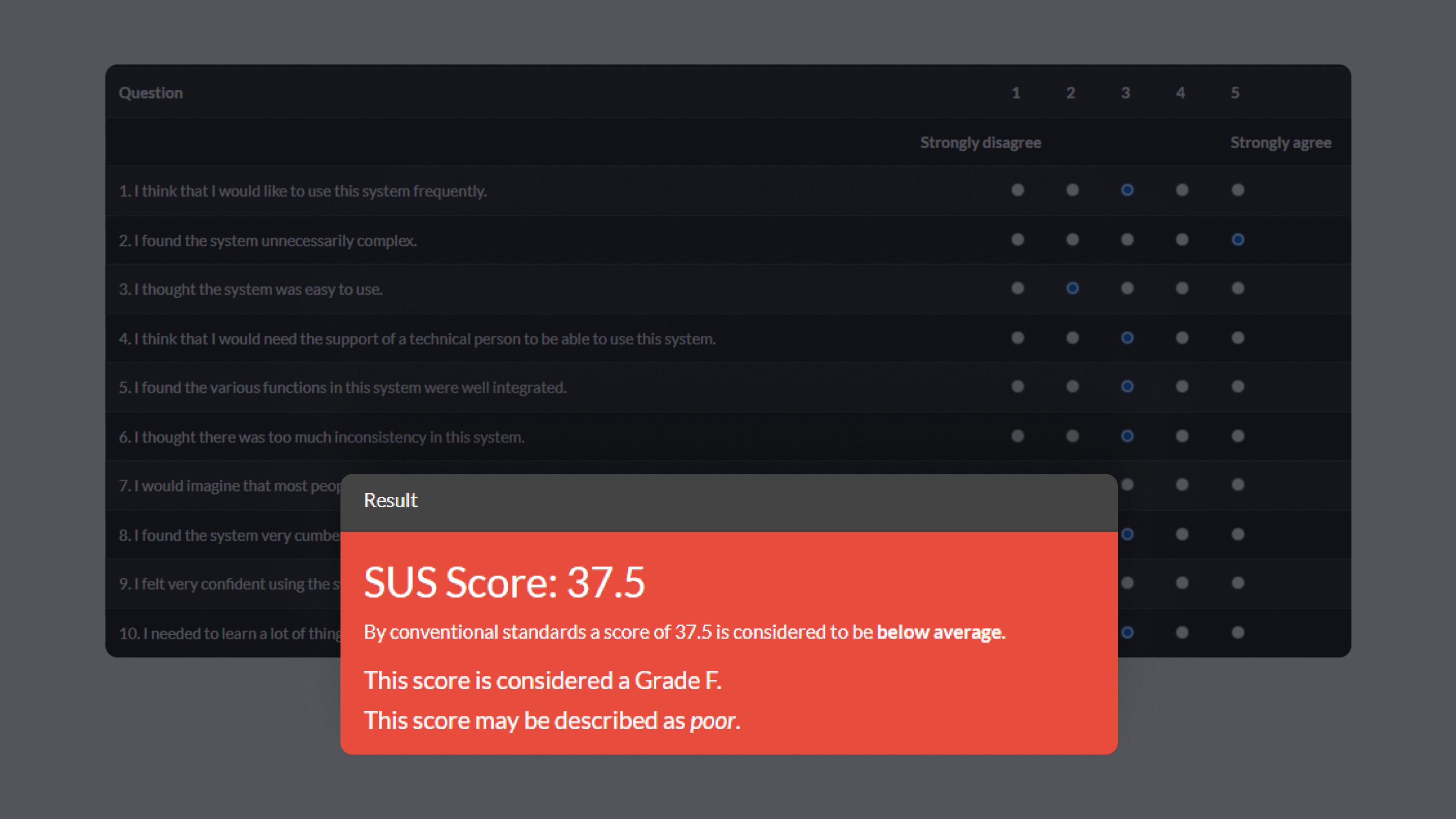
Unveiling Usability Gaps
Conducted a comprehensive usability test of the Steam website.
System Usability Scale (SUS) score was 37.5 (below average of 68, "Awful").
Gathered qualitative and quantitative data to identify pain points.
Charting the User Journey
Developed a detailed user flow for the entire website.
Visualized the complete user journey.
Identified friction points and inefficiencies.

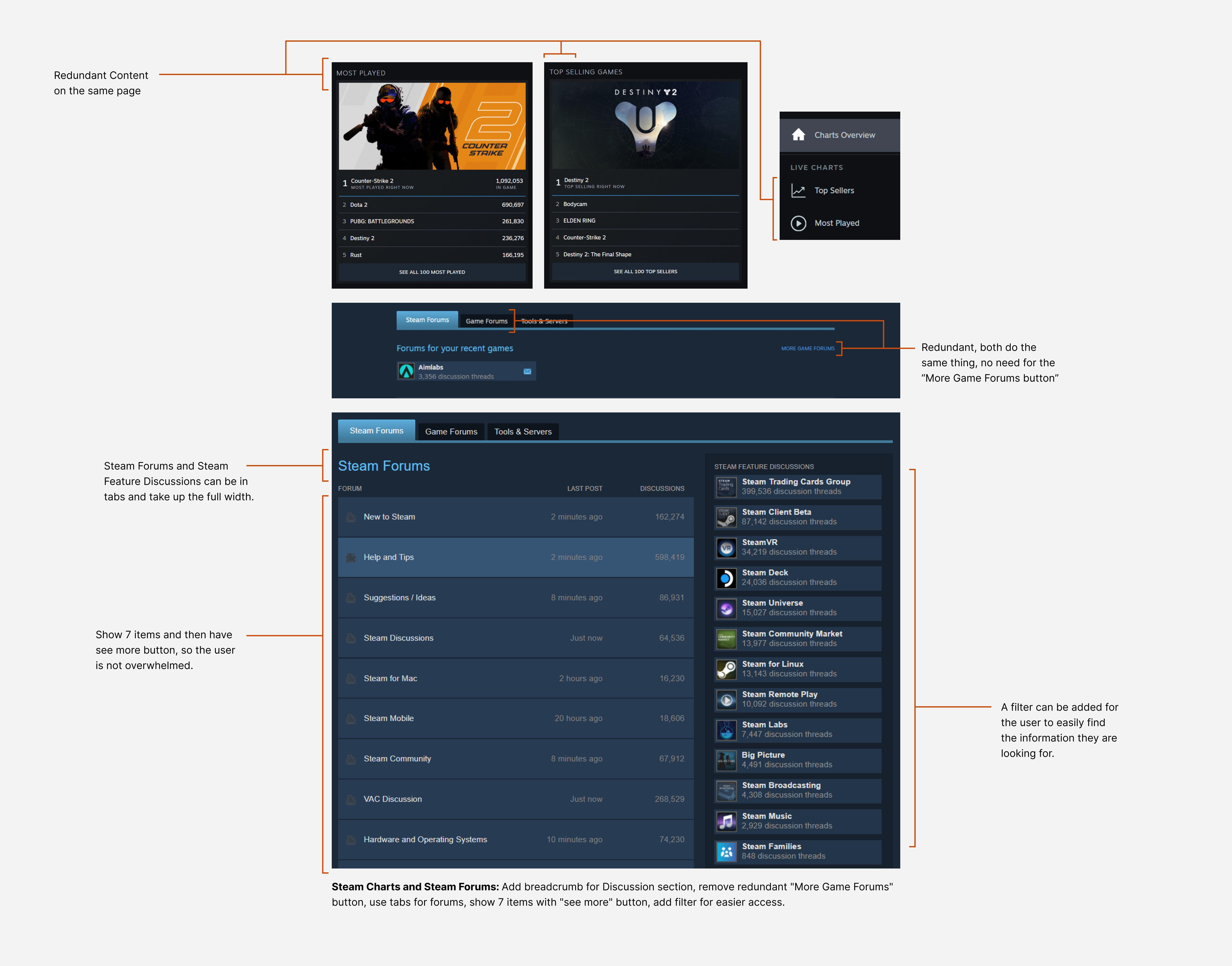
Spotting and Marking Redundancies
Analyzed user flow to find redundant elements.
Marked inefficient components in red.
Highlighted areas needing streamlining.
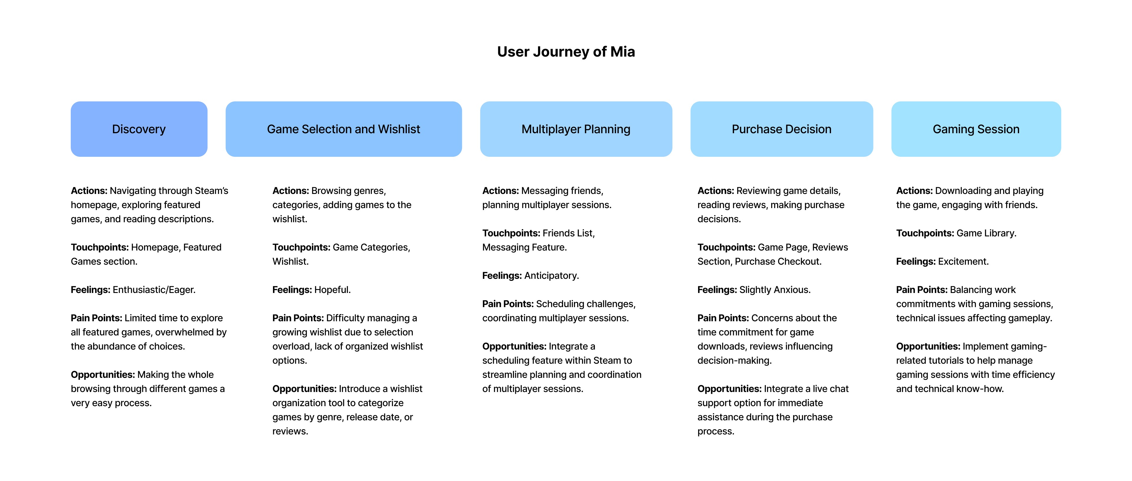
Decoding User Behaviors
Conducted extensive research to understand users.
Created detailed user personas.
Mapped user journeys, focusing on key interactions and pain points.
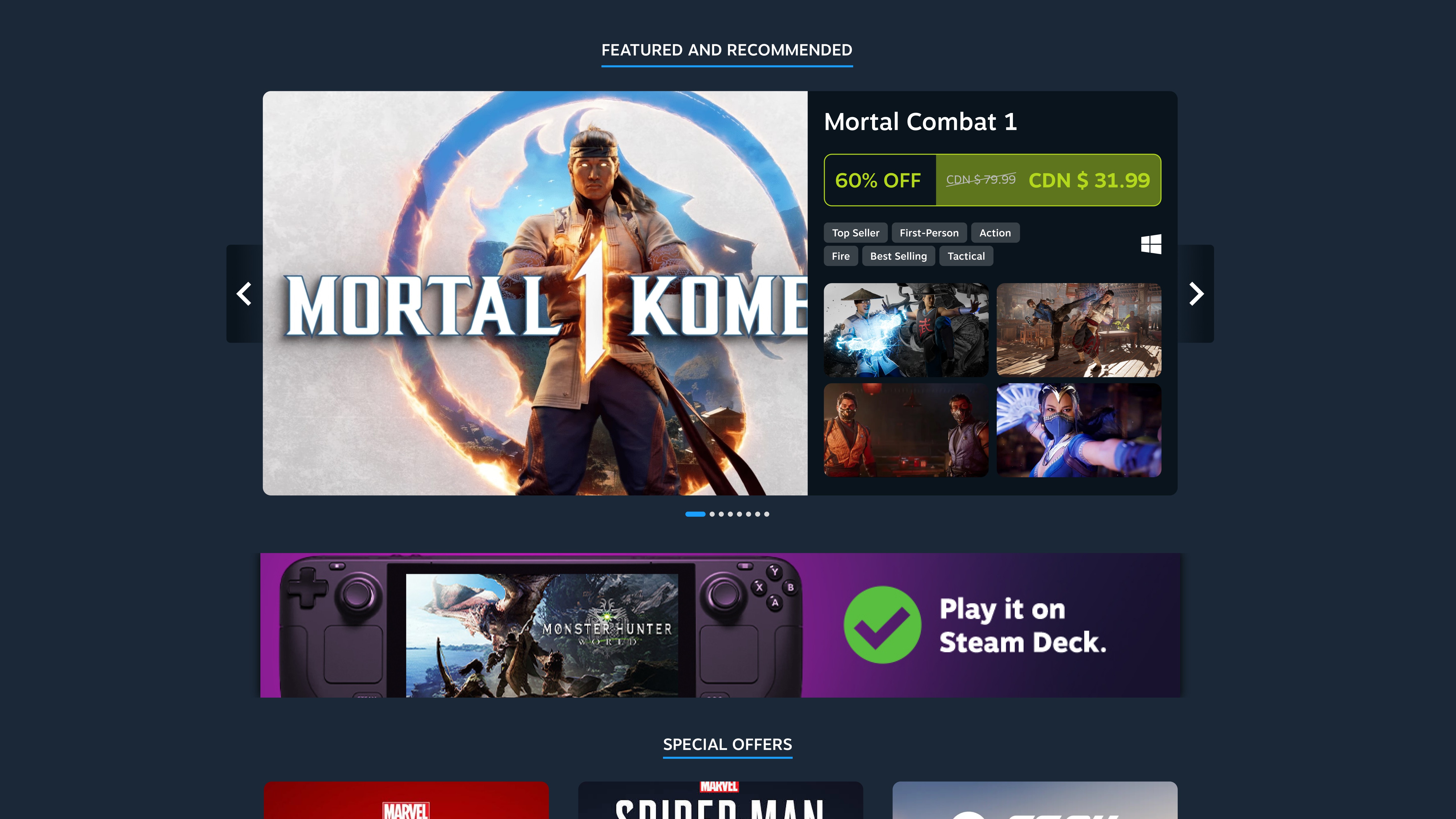
Evaluating the Existing Landscape
Performed an in-depth analysis of the Steam website.
Evaluated structure, functionality, and visual design.
Identified strengths and weaknesses.
Streamlining and Revamping the Interface
Removed identified redundancies.
Decluttered the interface and enhanced visual elements.
Ensured a consistent design language.
Simplified navigation and improved content organization.
Guided by insights from usability tests, user flow analysis, and user journeys.
solution
Final Outcome: Highlights
Each highlight captures an aspect of the Steam experience. It calls out which design goal it adheres to, what user scenario or problem it's addressing, and what the solution is.
DESIGN GOAL: Modern Aesthetic
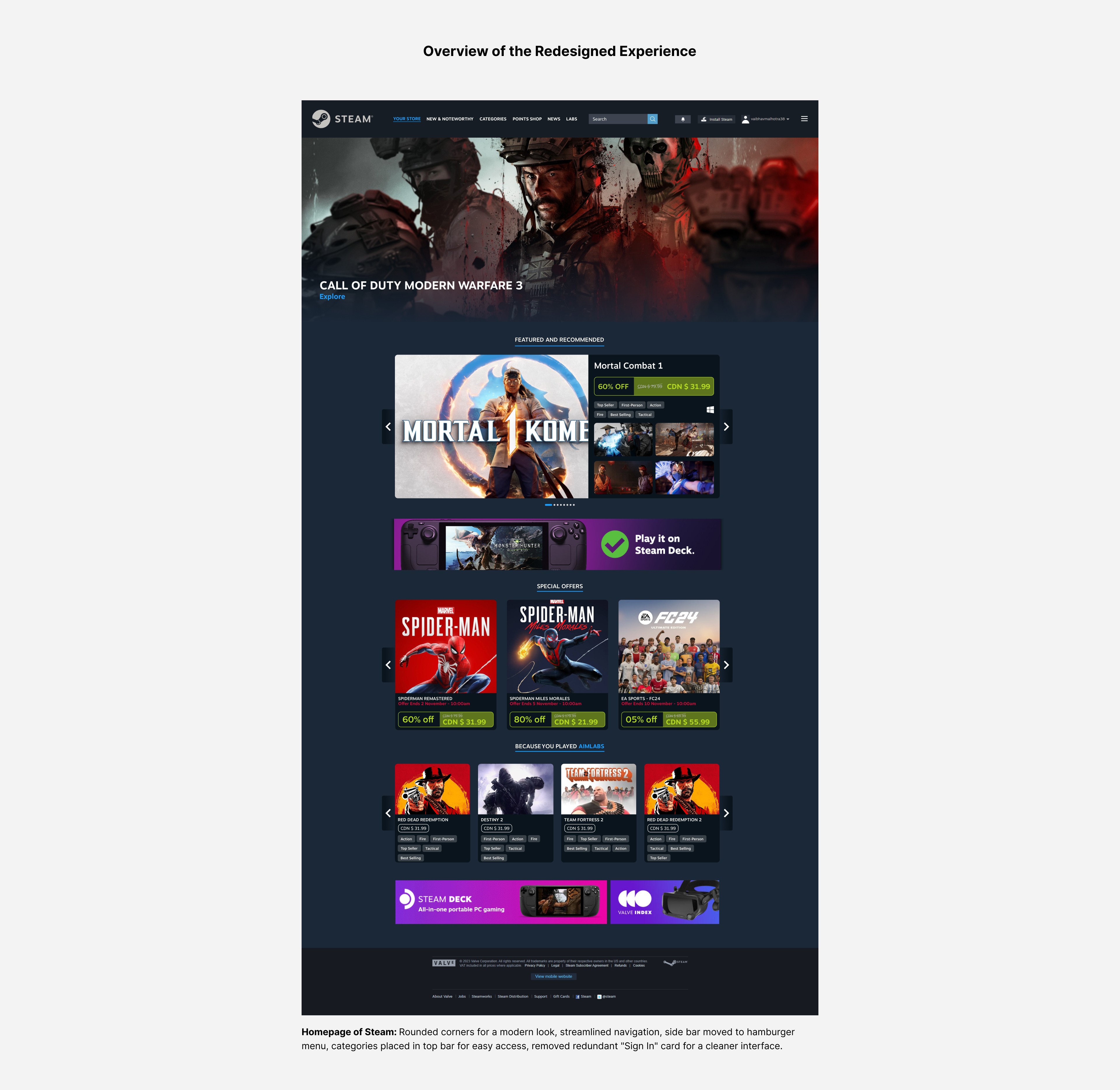
Rounded Corners
USER SCENARIO
Users find sharp corners and outdated design elements unappealing, impacting the platform's modernity.This visual inconsistency affects their overall perception of the platform's modernity.
Solution
Introducing rounded corners modernizes the interface, enhancing visual appeal and cohesion.
DESIGN GOAL: Simplified Navigation
Repositioning the Sidebar
USER SCENARIO
Users struggle with a prominent, overwhelming sidebar, hindering navigation.
Solution
Moving the sidebar to a hamburger menu declutters the interface, improving navigability.

DESIGN GOAL: Simplified Navigation and Enhanced Content Accessibility
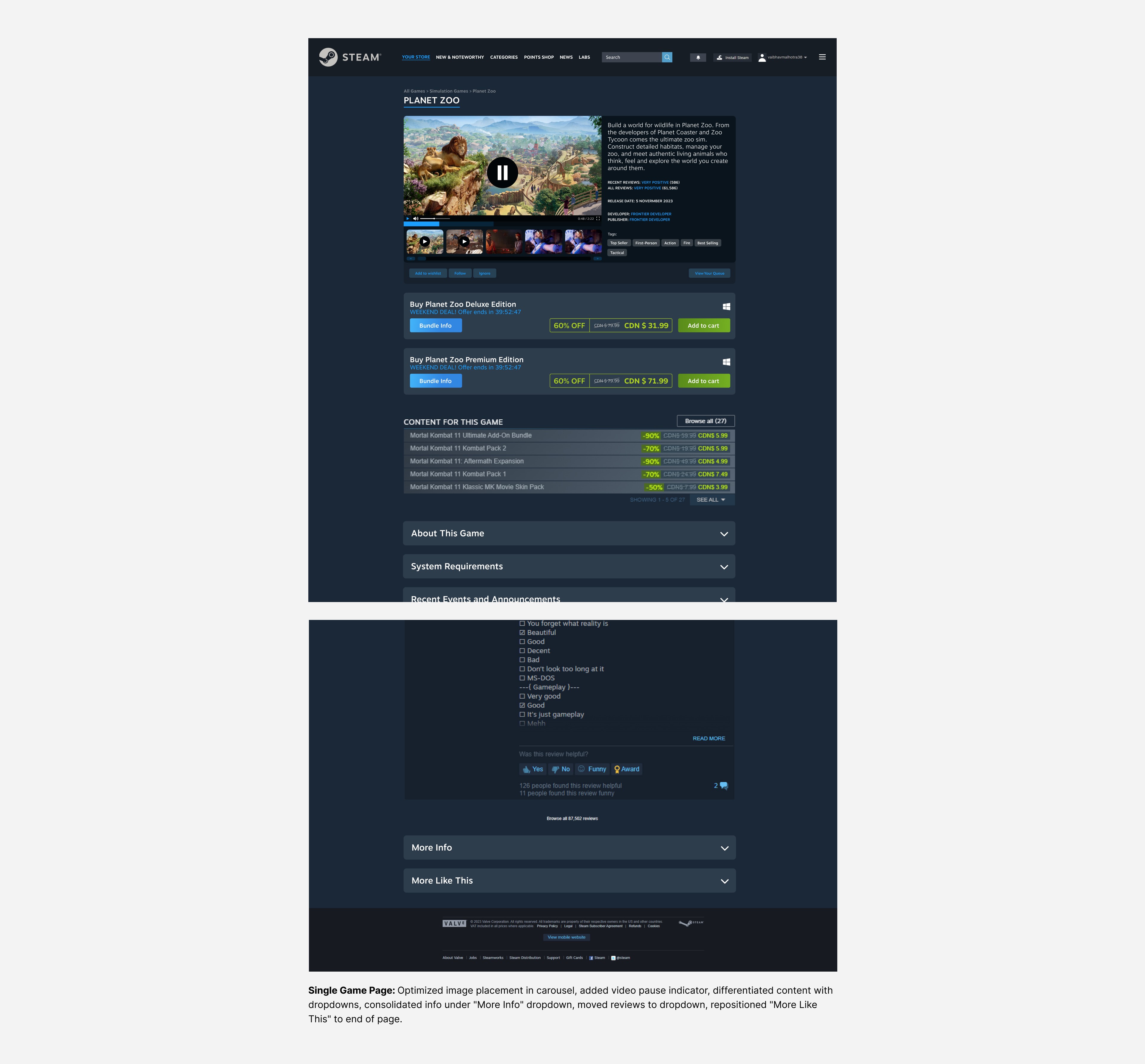
"More Like This" Section Placement
USER SCENARIO
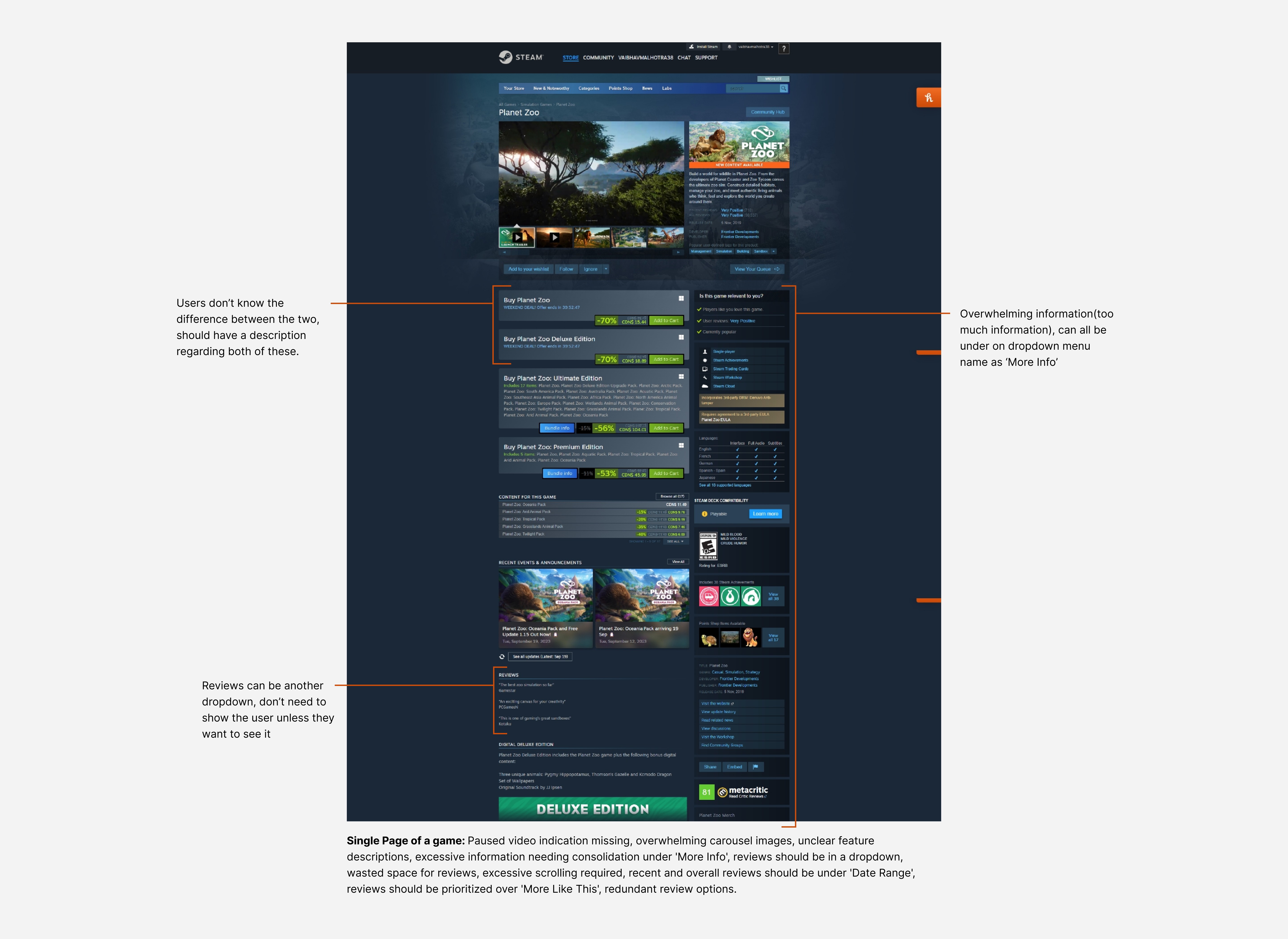
Users feel distracted by the "More Like This" section, diverting attention from current game details. Users also feel overwhelmed by excessive information presented on game pages.
Solution
Moving the "More Like This" section to the end of the page allows users to focus on current content before exploring similar options. Also grouping overwhelming information under a "More Info" dropdown menu provides optional access without initial overload.
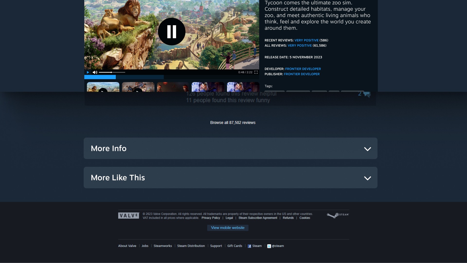
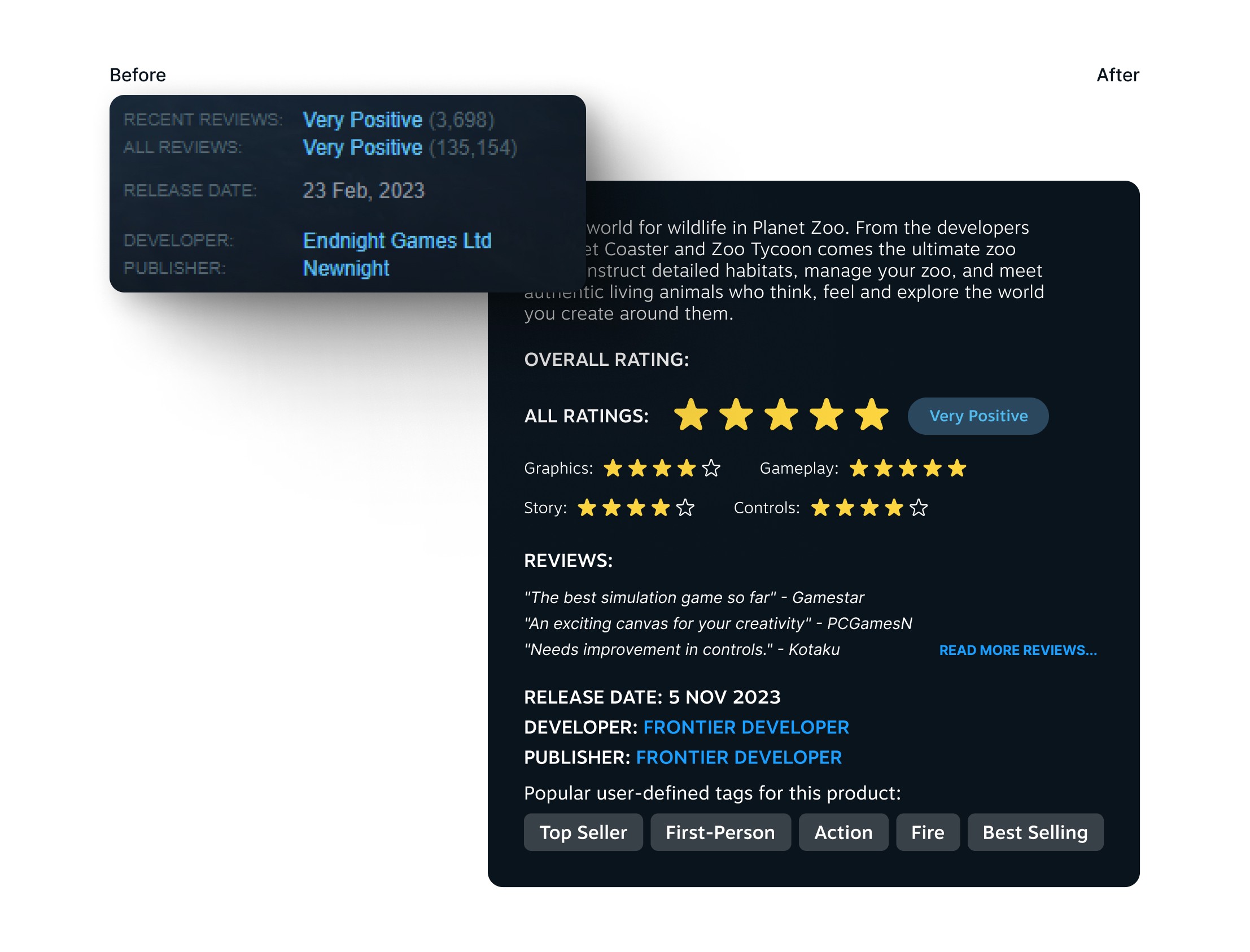
DESIGN GOAL: Enhanced Content Accessibility
Optimizing Image Placement on Game Pages
USER SCENARIO
Users find the terms "mostly positive" and "very positive" too vague, making it hard to judge a game's quality
Solution
Replace vague terms with specific percentages and review counts, like "84% of 135,154 reviews are positive." Use of star icons for categories such as Graphics and Gameplay. Include 2-3 one-line review snippets with a “Read More” link for detailed insights. This approach provides clear, precise information, helping users like Alex make informed decisions without feeling overwhelmed.
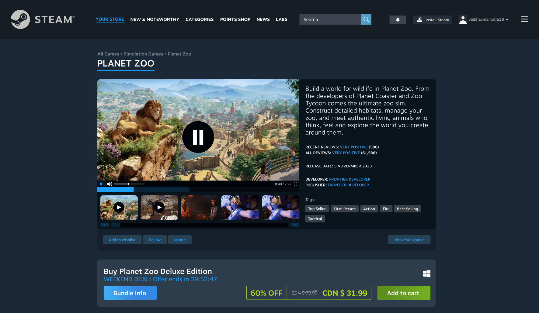
DESIGN GOAL: Enhanced Content Accessibility
Video Pause Indicator
USER SCENARIO
Users experience confusion when video playback is paused due to lack of clear indication.
Solution
Adding a pause/play button overlay when video is paused improves user understanding and control.
Learnings and relfections
│Listening to Users is Key
In this personal project, focusing on what users need and want helped me create a better platform. Usability tests and user feedback highlighted major issues and guided my redesign efforts, showing how important it is to keep users at the center of the design process.
│Simpler is Better
Simplifying the interface made a big difference in user experience. By removing extra elements and streamlining navigation, the platform became much easier to use. This project taught me that a clean, organized design can greatly enhance user satisfaction.